The Vision Behind Isle House, The First Waterfront Tower Pre-leasing on Treasure Island
Published on June 24, 2024
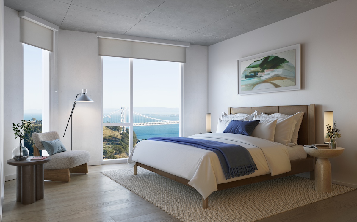
Isle House, San Francisco’s first new waterfront residential tower on Treasure Island, is nearing completion, now pre-leasing with the first move-ins slated for August 2024. The 22-story high-rise designed by David Baker Architects captures 360-degree views of the Bay, Bay Bridge, Golden Gate Bridge and San Francisco skyline. The tower features 250 studio, two- and three-bedroom apartments for lease, nine two-level, live-work townhomes with private entries, 1,140 square feet of street-level retail space, and verdantly landscaped courtyards.
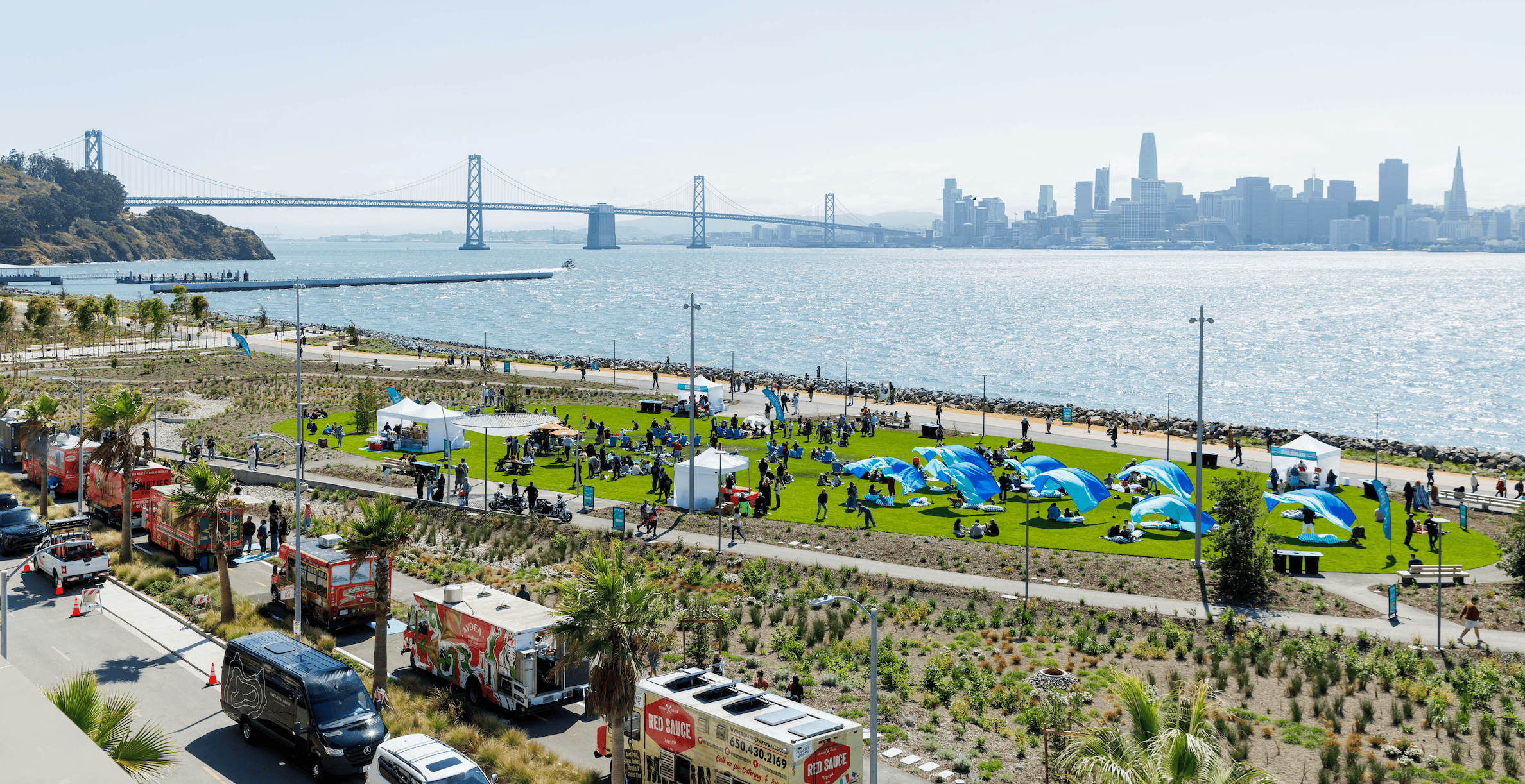
Isle House is the newest residential community since Treasure Island Community Development (TICD), a partnership between Wilson Meany, Stockbridge Capital Group, and Lennar Corporation, began transforming the island into a vibrant, sustainable, and connected waterfront community. Isle House is located steps away from Treasure Island Waterfront Plaza, Cityside Park, and the Ferry Terminal, which offers ~8-minute ferry service to Downtown San Francisco.
“The setting on an island in the middle of San Francisco Bay cannot be replicated anywhere,” says Pedram Farashbandi, AIA, Principal at David Baker Architects, a collaborative housing and urban design firm based in San Francisco. Below Farashbandi shares the vision behind Isle House and what makes the new residential community so unique.
How did the Treasure Island neighborhood inspire the vision for Isle House?
When we started designing Isle House, there was only a plan—no neighborhood yet. The Master Plan team did a great job expressing the vision for the neighborhood, setting out the framework for pedestrian- and bicycle-oriented frontages, curbless streets, and active edges. They set the overall tone for a community that really lets the natural environment and the connections between people shine. Instead of a dark or glassy tower, the brief was for light and bright buildings featuring subtle, quiet materiality and a warm, textured, earth-tone environment near the ground floors.
We achieved this by using brick and hand-crafted materials near eye level, with a clean, white tower above. Even though we used a window wall system for the 22-story building, we adapted it to create a punched-opening feel for the windows, which is a much more residential style. And even though we maximized the views with big glass panes, we kept the overall glazing to less than 50%.
How do you see the design interacting with the Treasure Island neighborhood?
As the first tower, we see Isle House as the heart of the new community and an icon for a new neighborhood—especially until the next few towers rise. Isle House is highly visible from the Bay Bridge and faces the park. We really thought about the composition, creating something that looks good from a distance as well as from a close-up, revealing an inviting human scale when you approach. The tower offers an invitation to the neighborhood. The close-up view gives an immersive sense of dynamic life in and around the building.
How would you describe Isle House to someone who has never seen it, how would you describe the experience of living there?
I would say that this community offers a range of home types, so there is something every lifestyle—and the shared common uses will bring everyone together. Homes on the courtyard are quiet, some with direct access to outdoor space. On the first six floors, the apartments facing the Bay are exposed to vivid views and nature. Apartments on the seventh floor have a close connection to the amenity lounges and roof deck. Upper floors really maximize the setting. The amenity spaces are beautiful, original, diverse, and highly functional. I think it’s an exciting place, part of a developing neighborhood and a new chapter for San Francisco—and we’ve designed it to be very comfortable for living.
With Isle House’s waterfront island setting, what challenges did you face in designing the development?
Being first is always challenging. We had to design the building multiple times, with varied configurations and heights, due to changing circumstances. We started designing in 2018, and were able to polish and finalize the design before construction began in 2022, so the building represents four years of continuous thought and refinement. The original idea was to have a full basement, which proved very difficult and expensive so close to the waterfront. Instead, we devised a way to place the full parking garage above ground without compromising the integrity of our vision for the ground floor.
Tell us about the design elements and materials used. How do they complement each other?
The lobby space is filled with unique materials that harmonize with and set the tone for the rest of the building—patinaed brass, live-edge wood slabs, and polished onyx. We used timeless materials, such as brick-glazed tile, concrete, and charred wood inside and out. Both the lobby and the exterior include hand-crafted tiles mixed into the industrial tiles. People really appreciate the handmade tactile elements, which express the human touch and love, without being too precious. We wanted to strike a balance between handmade and machine-made to create a comfortable space. While it’s unusual for the front desk to be designed by the architect, it is a strong part of the visual impact of the lobby. David Baker (of David Baker Architects) created “Intertidal,” a site-inspired dimensional ceramic art piece, for the lobby wall.
How did you maximize the indoor-outdoor connection?
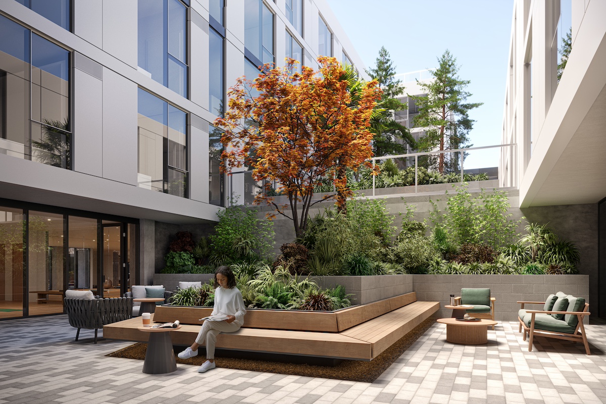
There is a direct stair connection from the main lobby to the second-floor courtyard, which offers terraced plantings and seating. At this level, the leasing lobby and yoga studio open directly onto this sheltered outdoor space. One level up, apartments have private patios that open directly onto the tranquil third-floor courtyard. The apartments above overlook these green spaces, as well as the views of the surrounding area. And of course, we have the live-work units that open directly to the streets with Dutch doors and private patios. Also, every common space in the building has a very strong connection to the outdoors.
What was the vision behind the two-level, live-work townhomes?
At ground level, a row of live-work units open onto a street and a pedestrian passage, with private patios and direct entries. These units have a small amount of independence from the tower, but fully enjoy the amenities and offerings of the whole community. They are prepared for commercial use, with one big floor plan for maximum flexibility, bathrooms, kitchens, and polished concrete floors. The upstairs level is designed for living. We see them working really well for professional offices, artist studios, or maker or service spaces, like a salon.
How did you envision the fitness studio and wellness lounge?
This fitness studio is really a standout. It has a very expansive view across the Bay to the San Francisco skyline, taking advantage of a truly unique vantage point. The gym opens to the yoga studio, which has a strong connection to a courtyard and features a lounge—an intermediate space between active working out and relaxation.
How do the outdoor communal areas elevate the lifestyle, from the courtyards to the rooftop terrace?
The courtyards are a quiet surprise. You can immediately perceive them when you enter the building, because they draw you in from the front door to the heart of the building, bringing in light, air, and life. The two terraced courtyards offer sheltered, immersive green space and provide a tranquil visual respite—a balance to the dynamic exterior views.
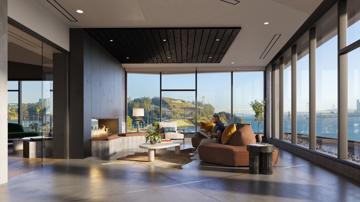
The seventh level is the amenity hub of the building. Inside, an expansive, continuous lounge space with a bar and game room is linked to a more private den, separated by a two-sided fireplace. This lounge opens onto an outdoor roof deck available to all residents. This vast, expansive rooftop zone is divided into smaller pods within heavily landscaped berms that form distinct areas or “rooms” or uses: There are spaces for everyone, and different spaces depending on the vibe you are looking for—more social or more intimate, and with different features like wind screens or fire pits. This level offers a full 360-degree view panorama.
What was the vision behind the ground-floor retail space?
There is a flexible space that can support a cafe or other neighborhood-serving retail at the corner of Burton and the shared public way, facing a future cultural park. It would have been a missed opportunity if we didn’t dedicate a portion of the project to use beyond residents of the building, and this is the right spot for a community space.
What is your favorite feature of the homes and the property?
One of the most special things is the experience—the journey—from the front door through the building and up to your home. You enter from a calm, landscaped pathway into a great lobby finished with beautiful materials, stop to check your mail in a mailroom covered in dramatic custom wallpaper, then pass by the richly landscaped central courtyard. As you take the elevator up, you get a fantastic view that gives you a big perspective on your place within San Francisco Bay. If it’s near the end of the day, you’ll catch a sunset from the elevator lobby on your floor. Heading to your apartment, the glass-capped corridor frames a picture-perfect view that will subtly change throughout the year. As you walk through the building, the circulation is simple and straightforward, easy to navigate. The varied views of the surrounding landmarks—from the bridges to the downtown skyline, islands in the bay, and the hills beyond—help with orientation. The building offers immersive views and a sense of connection to nature at every turn as part of your daily life.
How did you envision the streetscape around the building?
We’ve created a gracious buffer area around the building, setting it off with widened sidewalks, landscaping, and seating. The building is set along a shared public way open to pedestrians and bikes only. Half of the live-work units face the Avenue of the Palms, and half face the shared way. We intentionally placed these flex units so that they connect directly outward onto the street—with its landscaped transitional zone that blurs the boundary between the street and the building. You can’t really tell where the propertyline is—so that the liveliness of these units can spill out, activating the edges.
Why would it be hard to duplicate this property anywhere else?
Isle House represents a gateway to a new community, setting the tone for a developing neighborhood. Visible from the Bay Bridge, it is absolutely central in the view as you approach from Yerba Buena Island. The building faces the waterfront on one side and fronts a public park on the other, this iconic view will not really change. And of course, the setting on an island in the middle of San Francisco Bay cannot be replicated anywhere.
Isle House features the first of 1,000 new residences set to debut on Treasure Island in 2024. Explore leasing opportunities at IsleHouseSF.com.
You Might Also Like
All ArticlesSTAY UP TO DATE
on Treasure Island's Latest:
"*" indicates required fields

